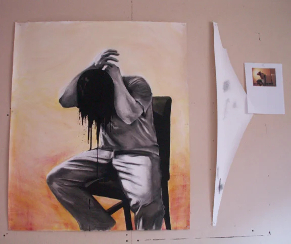
Self Portrait
Much of my studio artwork is created using ink on larger sheets of water color paper. Although this piece uses watercolor and charcoal as well as ink, it still contains the high contrast feel I gravitate towards. I also like the idea of creating larger artwork so the viewer’s field of vision can be enveloped by the artwork.
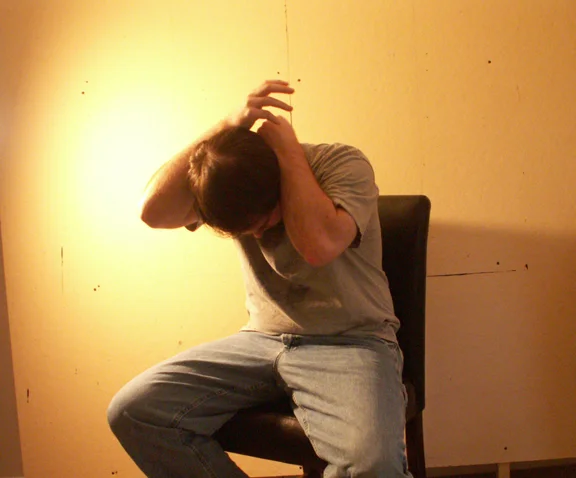
Reference image
I captured the original reference image using a camera timer and a lot of trial and error. There were several other poses I tried, but I like the interplay between the light and dark in this one best.
The 3 darkest parts of the image (the head, back of the chair and bottom of the chair) had a nice asymmetrical balance. And the head positioned right next to the lightest part of the background helped create the focal point I wanted. The position of the clawed hand above the head and the sharp folds in the jeans were also pluses.
I printed out this image and used it to create a rough pencil sketch on my larger (42.5”x36”) piece of watercolor paper.
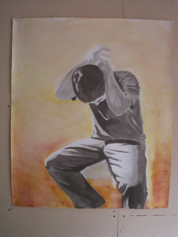
Initial ink wash and watercolor
I started with a very light ink wash to better define the figure areas. Once the entire body had these light grey areas I darkened the wash and worked through the entire body again. Most washes were wet on dry to create sharper lines of contrast. Some of these fabric transitions were smoothed out later using charcoal, but many were brought info even sharper contrast.
Afterwards I applied a fiery swirl of watercolor to the background. Although blue would have been the obvious choice for the tone of the painting I went with a warm color range to help the darkness of the figure pop out more.
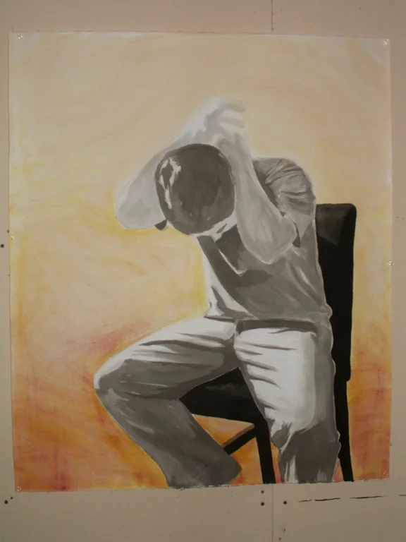
Inking Part 1
I began adding the chair’s darker focal points to the image to anchor the lower area. With everything else being so light it really help the body pop off the page.
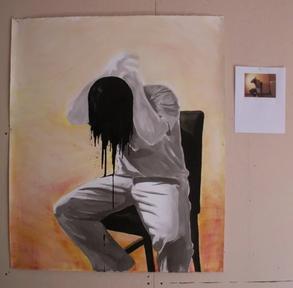
Inking Part 2
Adding the melting head was the final part of the inking process. For this part I went more by feel than any predetermined shape. It’s form breaks from the rest of the painting and in some places ignores it completely.
Charcoal
The charcoal process took the longest. I used it to smooth out fabric folds, create higher levels of contrast in on the body and pull together the overall cohesiveness of the painting.
Background Cleanup
I added a layer of charcoal to the background areas to help accentuate the head as the focal point and tone down the background color. Overall I think it worked although the charcoal background never smoothed out as much as I would have liked.
